Showing posts with label mid century. Show all posts

Saturday, July 26, 2014

On the Radar -- If I Designed a Restaurant...

So, it's been ages since I posted an On the Radar -- but I'm sure you're aware of that.  With us opening the shop in Liberty, and trying to keep the Etsy shop flowing along smoothly, I've just let the blog fall by the wayside.  And that's just wrong!  So I'm writing today (in an attempt to appease you, dear readers), and I thought I would share something I was working on in the spring with my class.

I teach Interior Design part time, and my class was working on a project to design a bakery/bistro/small restaurant.  I wanted to do the project along with them, but....the shop happened, yadda yadda yadda, see the previous paragraph.  But I did start to pick out furniture and finishings for my concept, and I thought you might find it interesting. 

My concept was for a bakery/coffee shop, to be called Plenty, that would have a Midcentury/Scandinavian feel with lots of color.  Not only would the bakery be super environmentally friendly through every facet of the business, but it would also focus on charity, by donating leftover baked goods at the end of every day to a local homeless shelter.  I was going for fun, brightness, lightness, and a feeling of joyfulness.  It may sound a little silly -- but I was focusing on the idea of a bakery where the customers might feel as if they are indulging themselves a little (um, cookies?), but really they are being socially concious -- especially if the bakery were to extend the charity even further with community customer reward programs and monthly highlighted local charity donation spots throughout the space. 

So now on to the fun part!  Beyond the Midcentury inspiration, I was thinking of Mucha, poppies, wheat, and Art Nouveau.  I know, weird combos.  But I think it totally works.  My picks...

The logo:

Artwork by The Black Apple (I added the name), get a print here.

Art:

From Mighty Vintage on Etsy, but it's been sold.
The Trappistine, by Alphonse Mucha
Wheatfields by  Jacqueline Penney
Wheat Weaving, image from here.
Flooring:


Lighting:

Found here.
Wheat Chandelier from Ballard Designs, no longer available.
I cannot find where I got this from!  Sorry!
Furniture:

Seling Imperial Mid Century sofa.  Sorry, not available!

Tangier Wing Chair, from Modshop, here.
Vintage Ekstrom chairs.

Sprout Cafe Table from Blu Dot, here.
Vintage Danish Modern chairs, here.
The Nerd Chair by Muuto, here.
Various accessories, prints, inspiration, etc:

Glasses from Usful Glassworks, here.
Scandinavian bread, here.
Sorry, can't find this!
This one sold.  It was from Une Vie de Boheme on Etsy, here.
Joel Dewberry fabric, here.
Soooo....tell me what you think!!

Friday, November 29, 2013

Bonus -- A Cabin Christmas

As previously discussed, the Christmas windows are never usually our favorites.  Mainly because we have parameters that are set by someone other than ourselves.  We're not divas -- we promise.  It's just that we like to challenge ourselves to approach each window differently, and make every one special in its own way.  But with the Christmas window, we know that the tree goes there, there must be presents under it, and it needs to look "rich and full".  (Don't ask.)  But it also needs to feel a certain bit of tradition, coziness, and usually, a fair amount of sparkle.

Well, we skipped the sparkle this year.

This year we decided to do a New England cabin/camping/fishing theme, based on our love of Rock Hudson's movie, Man's Favorite Sport?.  Made in 1964, Rock is a published fishing expert who actually doesn't know how to fish.  He works at Abercrombie and Fitch, and when his boss enters him into a fishing tournament, he gets outfitted with all of the coolest gear.  It's a feast for Blackbird eyes between the sets, clothes, and camping gear!


Our other inspiration was my obsession with Hudson Bay blankets.  I wish I could have stacks and stacks of them.  I recently found a red Pendleton one at an antique shop, and I thought the other Blackbird was going to have to drag me out of the store.  I wanted that blanket to live with me -- and since I couldn't afford it, I almost decided to just stay there and live with it.  It was a red Hudson Bay blanket, people!  And made by Pendleton!


Anyway, we used the stripes and the colors as a jumping off point for the rest of the window.  We found a great wrapping paper with trees that made for an interesting background, but wasn't overpowering.  We had the brilliant idea to make our own ornaments -- it's expensive to buy new ornaments every year, but it's very limiting to use the same ones over and over.  So we went to a thrift shop, bought some ugly 1980s glass balls, and spray painted them in green and cream.  We then painted the cream ones with Hudson Bay stripes.  The tree needed a garland, so we made a traditional paper chain, but updated it by using brown craft paper cardstock, and making the loops a little skinny and more delicate.  We made wooden plaques with animal figures cut out of scrapbook paper, and little wooden house cutouts got painted with houndstooth and plaid patterns.  We raided the fishing section at a discount store, and got all kinds of brightly colored lures and spinners.


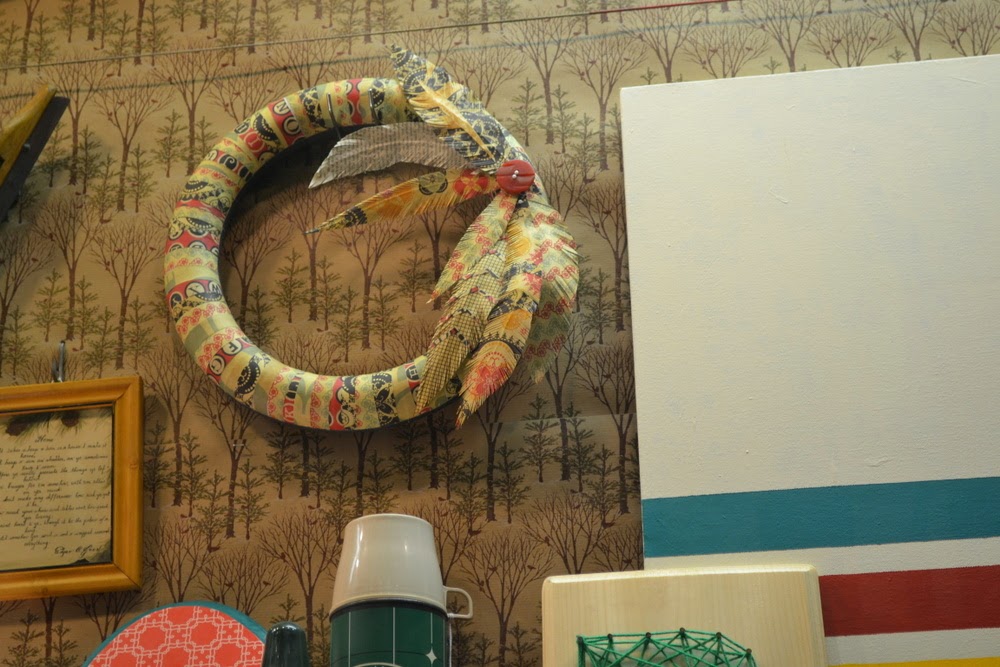
We created the artwork on the fireplace mantel with a spare canvas we had at the house, found at a thrift shop for $1 and stashed away for something like this.  Several layers of cream paint went down first, and then we taped off stripes and painted them the Hudson Bay colors.  We needed a few more decorations, so we made a wooden plaque with a deer cutout in bright scrapbook paper, a string art monogram, and a lovely scrapbook paper covered wreath with handmade paper feathers.


The presents under the tree were themed as well.  We included fishing gear, toy boats, a tiny folding sling chair with a teddy bear, a vintage plaid flannel shirt, flashlights, and a sled.


We had been stashing away cabin merchandise because we knew we wanted to do a cabin window.  And we love the way it turned out.  Rock Hudson would be proud!


As a final note, we also decided to make our window charitable for the holiday season.  Collector's Antique Mall is hosting a food drive, and we've donated 50 handmade ornaments that coordinate with the window.  While supplies last, for every 5 cans of food you donate, you can pick out one of our ornaments to take home with you.  It starts today, November 29, 2013.


Sunday, July 7, 2013

The Skinny -- Paul Himmel

Grand Central Terminal, NYC, 1947

Paul Himmel, an American fashion and documentary photographer, was born in 1914 in New Haven, Connecticut.  His parents were Ukranian immigrants.  They moved to Coney Island in 1922, and opened the country's first vegetarian restaurant.   

As a teenager, Himmel taught himself about photography.  But he went to school for science, and began teaching in 1932.  It wasn't his calling, though, and he then studied graphic journalism at the New School with Harper's Bazaar art director Alexey Brodovitch in the late 1940s (Brodovitch worked there from 1938-58).  

Himmel's portrait of Bassman

It was his relationship with Lillian Bassman, the love of his life, that most affected Himmel, though.  He met her in 1923, married her in 1935, and exhibited his first work in 1939 -- photos taken while on a trip to Mexico with her.  Bassman was also a fashion photographer, and is very well known in her own right.  They were married over 73 years.

He started to work as a professional photographer in 1945, and by 1947 he was working steadily as a fashion photographer for Bazaar and Vogue.  He was one of the very few who worked for both magazines.  Unfortunately, all his negatives from this time have been destroyed.

Bassman and Himmel, 2003

By the 1950s, bored with the commercialism of his fashion work, Himmel started his own art projects.  He looked to the human form for inspiration, focusing on people who used their bodies in their own work, like ballet dancers, circus performers, and boxers.  He experimented with grain structure in his negatives and prints, using a series of silhouetted and elongated forms abbreviated almost to the point of abstraction.  His photos are high-contrast, emphasizing the design and patterns contained in the image.

ballet in action, 1954

He published a book, ballet in action, in 1954.  It had an extensive foreword, written by George Balanchine, the lead choreographer of the New York City Ballet.  In 1955, some of his images were included in a show curated by Edward Steichen, called "The Family of Man" for MOMA.

ballet in action, 1954

Himmel took his last photograph in 1967, and by 1969, he became disenchanted with photography and retrained as a psychotherapist. He worked in psychotherapy for more than 25 years.  An exhibition at the New York Galleries, by Howard Greenberg and James Danzinger, in 1996 reintroduced his work; it was an instant success, and a new book of his work was published.

Abstract Nudes, 1954

Paul Himmel died February 8, 2009.


*Info from artnet.com, theworldofphotographers.com and Wikipedia

Friday, January 4, 2013

The Skinny -- Fornasetti

Piero Fornasetti
You probably know his work even if you don't know his name.  Piero Fornasetti's art is instantly recognizable and graphically stunning.  He was not only a painter, but also a sculptor, interior decorator, designer, printmaker, and engraver. He created more than 11,000 products from his art, ranging from furniture to ceramics to wallpaper. 

Born in Milan in 1913, Fornasetti attended, and was expelled from, Brera Academy, where he studied drawing, in the first two years of the 1930s.  A year later, in 1933, he exhibited his very first piece of art in a student exhibition at the Milano University.  Fornasetti also designed a group of silk scarves, printed with newsprint and architectural motifs, exhibited at the Milan Triennale. 

He was conscripted into the Army during WWII, but instead of fighting, he was given the task of painting the regimental barracks in the Piazza San Ambrogio.  He was exiled to Switzerland from 1943 to 1946 to avoid more military service, but continued to produce his art throughout this time.

In 1940, Fornasetti met Gio Ponti, an Italian architect and designer, and designed ‘The Lunar’ illustrated Calendar book for him.  He worked continuously with Ponti until his death in 1979.  They collaborated on designing art, products and furniture, as well as interiors, such as the complete interior of the Casa Lucano, the ocean liner Andrea Doria, and the ballroom of New York's Time-Life building.


Fornasetti's most important contribution was the joining of design and art through furniture, interiors, and products.  He was one of the first to develop the idea of "branding" himself and serially producing his art for public product consumption.   

His work includes constant use of black and white, the sun and time. His style is heavily influenced by Greek and Roman architecture.  His most famous work is, without a doubt, his illustrations featuring the face Lina Cavalieri, an operatic soprano.  Fornasetti found her face in a 19th century magazine, turning the black and white image into an iconic representation of his work. It was known as the “Tema e Variazioni” (theme and variation) plate series.  He said:
“What inspired me to create more than 500 variations on the face of a woman? I don’t know. I began to make them and I never stopped.”  

Tema e Variazioni

Fornasetti's work faded in popularity throughout the 1970s, but with the opening of the design store, Themes and Variations, in London in 1980, interest was reawakened. He published a book in 1987, a collaboration with Patrick Mauriès that illustrated his collective works.  Piero Fornasetti died in 1988 at age 75.  His son, Barnaba Fornasetti is continuing his dad's legacy by continuing to produce his work.


Covered Latte Cups from Barking Sands Vintage on Etsy
*Information from http://www.fornasetti.com, wikipedia, and www.sinaiandsons.com

Monday, October 8, 2012

Junk Love Monday: It's Black and White

It's no secret that the Blackbird girls love color. We shudder at the thought of a room with white walls. Red, teal, aqua, navy--our house looks like a Skittles factory exploded. But we also love the graphic, stark contrast of black and white mixed in with our rainbow.

The Pizio collection.
It started at a pottery show. We went specifically to visit one of my favorite clay artists, Stacy Lambert. We got to the show five minutes before the doors opened, and somehow, Stacy was already sold out. I stood there, wavering between denial and disappointment, trying to ignore the pounding in my head (you try driving 45 minutes to buy something that no longer exists by the time you get there, and see what kind of headache you end up with), when I happened to glance at the next vendor down. The pounding in my head traveled south to my heart, and I knew it was love. The table was filled with black and white pottery--owls, crows, gnarly trees...and, thanks to Leanne Pizio, a new collection was born: sgraffito.
Leanne Pizio's pottery chicken heads

We both purchased pieces, and by the time we placed them on the piano at home, knew that we had to have more. It seems like just yesterday that our collection was such a baby (only 3 pieces!), and now it has grown into a beast. We just call it The Pizio. It has grown from the piano, up the walls, across the house, and wormed its way into any available space it can find. We have allowed it to acquire color (we love the aqua!), but the majority of it is black and white perfection.

It was only after we had been collecting the Pizio pottery for a few years that we started to notice vintage sgraffito.  For two people with very little restraint, this is bad news (in a good, good way). We have a lot of conversations that start with "If we had a bigger house...," and this is one of the reasons why. If we had a bigger house, we would not only own every single piece of Leanne Pizio sgraffito that we could get our hands on, we would own every piece of vintage sgraffito we could find.

Marianne Starck for Michael Andersen Pottery, 1950s

Marianne Starck for Michael Andersen Pottery, 1950s
And, if we had a bigger house, and it happened to be in the Czech Republic, we would want it to look like one of these:

Exterior of Schwarzenberg Palace, Czech Republic

Czech Republic, Sgraffito Exterior; photo by Paul Harris